Countdown Block

Show all elements

Days

Hours

Minutes

Seconds

Hide Days

Hours

Minutes

Seconds

Hide Days and Hours

Minutes

Seconds

You can hide any elements you want. You can also hide the labels.

Date & Time

This section is used to set the date and time when the count down ends. You can either set it via the drop downs or via the calendar.


Settings

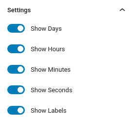
This section allows you to toggle elements of the count down. You have separate controls for days, hours, minutes, seconds and labels.


Block Appearance

Under the block appearance tab you can control how the block looks. Let’s take a look a the options.

  1. Box Text Color: This option allows you to set the color of the count down text.
  2. Box Background Color: Controls the color of the box’s background.
  3. Box Label Text Color: Changes the color of the labels.
  4. Block Background Color: Controls the background of the entire block.
  5. Border: This option allows you to select the border style via the drop down and then select the border color and width.
  6. Border Radius: This option allows you to round the box’s corners.
  7. Box Shadow: This option allows you to apply an inset/outset box shadow, its color, spread, blur radius and offset.
  8. Box Max Width: Allows you to set a maximum width for the boxes (relative to their container).
  9. Number Font Size: Set the font size for the numbers either via a drop down of preset values or by setting an exact pixel value in the input.
  10. Label Font Size: Set the font size for the labels either via a drop down of preset values or by setting an exact pixel value in the input.
  11. Label Top Margin: Control the spacing between the numbers and the text below.
  12. Padding: With this option you can control the padding on each side of the block individually or all at once.
  13. Margin: With this option you can control the margin on each side of the block individually or all at once.

Notice that the Font Sizes, Padding and Margin options have three icons next to their label. These are the Desktop, Tablet and Mobile icons. By clicking each icon you can separately modify the control’s values for each device.


Visibility Settings

Via the Visibility Settings you can hide the block for certain type of device or user.

The Viewport visibility toggles allow you to hide the block on desktops, tablets and mobiles. You can choose to hide it on more than one device type.

The Authentication visibility toggles allow you to display the block only to logged in or logged out users.


Animation Settings

Via the Animation controls panel you can set up how you want the block to animate upon entering the viewport as your visitors scroll.

  1. Animation type: Choose the animation type for the block. You can select from Fade, Slide Up / Down / Left / Right, Zoom In / Out, and Flip Up / Down / Left / Right. Set to None if you want to disable the animation.
  2. Duration: Controls how long the animation will take from start to finish. Defaults to 0.7 seconds.
  3. Delay: Controls the delay from the moment the element enters the viewport to the moment when the animation will begin.
  4. Easing: Controls the animation’s easing. Refer to the easings page for a visual representation.
  5. Repeat animation: Repeat the animation for the block every time it enters the viewport. While your users scroll down the animation will fire, and when they scroll back up it will fire again. Every time the block leaves the viewport the animation will be reset.

Note: If you don’t plan on using animations you can turn them off globally in Settings > GutenBee settings. You can disable the “Enable block animation controls” checkbox and the animation panels and scripts will stop showing up and loading.